
Eric
-
Posts
1,284 -
Joined
-
Last visited
-
Days Won
68
Everything posted by Eric
-
I agree that there are risks to upgrading, and few benefits. Best to leave a working business machine alone. But I guarantee that there isn't going to be a VISTA fiasco, since Windows 7, 8, and 10, are all essentially Vista.
-
For the sake of discussion, here's an additional page that I came across this morning. But I never know whether to trust the information. http://judismithlaw.com/overseas-freelancer-w8ben-or-w8eci/
-
That strikes me as odd. When I do contract work, I'll fill out a w-9 and they don't withhold anything. They'll send me a 1099 at the end of the year, and I pay taxes on the income then. Can you link to what you quoted from? I was really hoping that the purpose of the W-8BEN was to document whether withholding is necessary. I say that, because I'm being told that they're cutting a check for the full amount, and it's up to the contractor to report the income.
-
Alright, so here's the backstory. My full time job is as the webmaster for a University. We're going through a website overhaul this summer, and hired a designer through 99designs.com. 99designs allowed us to host a design contest for the work that we needed done, a flat fee for the contest is paid up front to 99designs, and once both parties (designer and client) are happy with the work, 99desings takes their cut and sends the rest to the designer. Now, we have additional work for the designer, and he says he accepts PayPal. We can't just sign up for a PayPal account with a Purchasing Card, though, we have to jump through some hoops to add this guy as a vendor to our system, and make him sign contracts and forms and whatever. Oh, and I forgot to mention one relevant detail, the designer resides in South Africa. So, I'm told that the first step is to send this guy a W-8BEN for him to fill out. He does a little looking around and comes across the following page and reads that he'll be on the hook for 30% http://blogs.angloinfo.com/us-tax/2012/12/24/what-is-form-w-8ben-and-what-is-it-used-for/ That's a large chunk. Am I missing anything? EDIT: My understanding, for what it's worth (hint: not much at all) is that since he is not, nor ever has been to the United States, he fails the Substantial Presence Test, and therefore has no tax liability to the US. http://www.irs.gov/Individuals/International-Taxpayers/Taxation-of-Nonresident-Aliens Am I wrong? I have no idea what the deal is with that 30% flat figure is for or when it comes into play, but I'd be interested in knowing.
-

Eric, why the double space on enter/carriage return
Eric replied to BulldogTom's topic in Website Help
The Enter key creates a new Paragraph. On the web, Paragraphs almost always are double spaced (have a bottom margin, that is, white space between paragraphs) to improve readability. The reason that style is so common is because indentation of the first line (like in newspapers) is almost never used and not having either styling leads to a difficult-to-read monolithic slab of text with no visual separation between paragraphs. It's pretty much standard practice for Enter to create a Paragraph. There isn't a feature to change it per-user, I'm afraid. The only thing I could do is change Paragraph styling site-wide to remove that bottom margin for all paragraphs, which I'm reluctant to do for two reasons: I'm not sure that everyone wants it that way, like I said Enter = Paragraph is pretty standardMore importantly, every paragraph in every thread would lose its bottom margin, and as a result we'd have no spacing between paragraphs, just that monolithic slab of text in every post.Anyway, in instances where you don't want a new paragraph, what you're looking for is a "line break". Most word processors, including Word and this site's editor have a shortcut to create a line break. Here (and in many programs) it's Shift+Enter. Sometimes it's Ctrl+Enter. If your problem is that you have changed the default behavior in Word and other applications, and when you get here you're creating double paragraphs by mistake... All I can say is sorry for the frustration -
Haha, they're boy/girl twins, he's on the left. It's an easy mistake to make though, since he's got a hippy haircut and wearing his sister's dress in that pic.
-
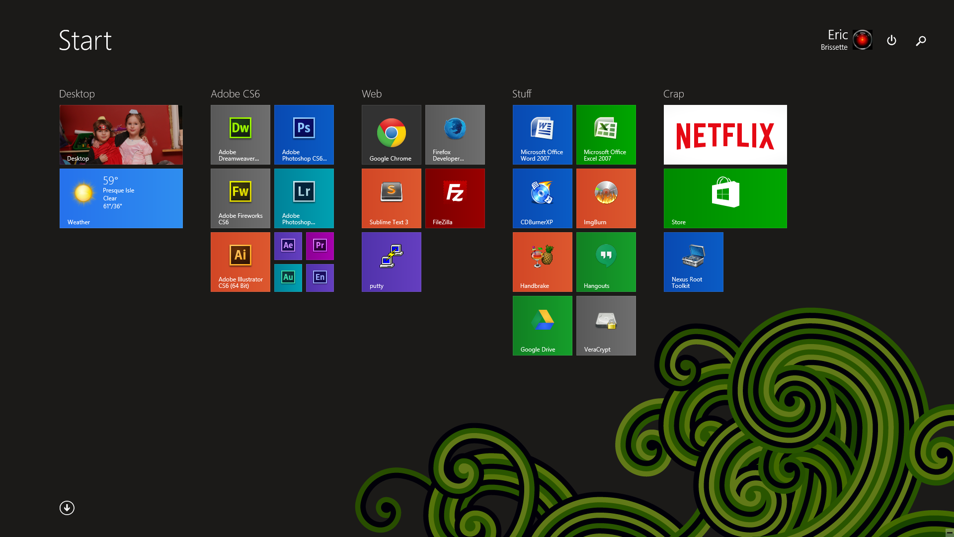
8.1 has an option to send you directly to the desktop and bypass the start screen when the computer boots. I see the Start Screen as an alternative to having shortcuts on your desktop, with the added benefit of being able to type a few letters of the name of a file/application on your computer and having it quickly found. Hit enter to open/execute it. I find it a lot faster than Start > All Programs > Scroll through folders > Click folder > Click shortcut but to each their own. This is essentially the same way I used the Start Menu in Windows 7, though, because it also had a search bar built in. Not the same computer I was on yesterday, but here's another screenshot. It's just a full screen start menu. It's got shortcuts for launching applications. Visually, it's different. Functionally it's similar, except for the All Programs area, which I don't care for in Windows 7 OR Windows 8 because it's a mess of everything installed on your computer and cumbersome to find anything... hence my preference for using the quick search features in both operating systems.

-
There are things in 8 that I prefer not to use, so I pretend they don't exist... but for the most part, the stuff that's in 7 is also in 8. Once I have my applications open, there is zero difference. My frequently-used applications are still pinned across the bottom, but also pinned on the start screen, which I rarely need to use. Here's a screenshot of my 8.1 desktop. If you can give examples of specific things you find more difficult, I might be able to suggest an easier/faster approach.
-
There are gestures for swapping between programs on Windows 8. They apparently work well on a touch screen, but are super annoying if you're using a laptop with a trackpad / touchpad. The trackpads on Windows laptops are almost universally terrible. http://www.makeuseof.com/tag/3-ways-to-disable-windows-8-gestures/
-
Somewhat, but not exactly. They've changed the Start Menu. It was full screen in Windows 8, but in Windows 10 it's like a cross between 7 and 8, and not full-screen. Windows 8 has a bunch of settings and stuff that are all touch optimized.. things like changing wallpaper, networking, and other control panel functions. But the Windows 7 Control Panel is still there if you know how to get at it. I still use the oldschool control panel for everything... can't stand most of the new settings stuff. Windows 10 refines a bunch of those things, so I'm willing to take another look and see if it's grown on me at all. But I'm guessing for anything more complicated than connecting to Wifi, I'll be back to the old control panel. So in that sense, once you adjust to finding the Windows 7 style control panel, and adjust to a few other things, it should mostly be business as usual, but with a bunch of new features to explore. Unified notification area, new views for currently running programs, stuff like that.
-
I think you're right to be leery. I haven't done a real upgrade since 3.11 to 95, which went very badly. My current computer (or at least most of it) has seen Windows Vista, 7, 8, and 8.1. All fresh installs except for 8.1, which I guess technically was an upgrade, but it was so minor it was more like just the usual Windows Update process. I think that shows where Microsoft is headed with Windows releases... making them more minor instead of having huge monolithic overhauls once every 2 or 3 years. The updates will be smaller, cheaper (sometimes free), less jarring, and less likely to go wrong--similar to how Apples does it with OSX. As for a Windows 7 to 10 upgrade? Idunno, personally I'd do a fresh install because skipping 8 and 8.1 seems like a bigger jump. Windows is very complex software. PCs are complex machines with near infinite combinations of parts and drivers. Lots there to go wrong... I don't know if I'd risk it unless you had a backup ready for a fresh install first.
-
If you're primarily worried about bugs and glitches, then you don't have much to worry about in Windows 8.1 or 10. Windows 7, 8, and 10 are all incremental updates to Windows Vista. Vista was the buggy release, the last big platform change after Windows XP. Performance/stability has only improved since then, starting with Windows 7, getting better in 8, and presumably better again in 10. If you're worried about the touch-optimized interface, well, I think you're screwed. You'll have to learn to use it or learn to avoid it at some point, and whether you figure it out in Windows 8 or Windows 10 doesn't really matter much. The harsh reality is that touch devices are killing PC sales, and Microsoft is in the business of staying in business.
-
N/T - Need advice on fundraising for friend's medical needs
Eric replied to jklcpa's topic in General Chat
Jack raises a good point about the transaction fees. Even reputable grassroots funding sites have to pay the bills somehow. Firstgiving.com for example has a 15% transaction fee. Gofundme.com is 7.9%. Compare that to a payment processor alone, such as PayPal or Stripe.com, which is more like 30 cents plus 3-4%. Take a close look at the transaction fees and compare that to the tools the sites offer. Spreading the word is only part of the benefit. Some of those sites also offer tools for tracking donations, getting the word out to a wider audience, and probably most importantly, letting people massage their egos by posting their donations on the site and on social media with a fancy badge. That's not to say that people donate for the wrong reasons, but I have no doubt that it pushes some to donate rather than not, or to increase the size of their donation. -
core_emoticon_group_default That's... user friendly. I'll see what I can do about that.
-
There's a chunk of Latin filler text that's very commonly used in graphic design, called Lorem Ipsum. It visually flows like real copy would, better than a bunch of unnatural looking random character gibberish, but doesn't distract the viewer with unimportant (at that point in the design process) details/meaning. This is a variation on that called Bacon Ipsum--apparently it only satisfies the first requirement for good filler text but fails miserably for being a distraction. And now I'm hungry too.
-
Bacon ipsum dolor amet salami brisket andouille, pork chop pork belly pancetta short ribs beef ribs shoulder tongue pork loin venison shankle kevin. Hamburger filet mignon beef ribs t-bone turducken shoulder prosciutto picanha ham. Cupim short ribs bresaola, tongue andouille turducken swine pig. Doner shoulder meatloaf pancetta capicola rump. Ground round corned beef kielbasa alcatra rump. Jerky picanha cupim, chicken beef jowl meatloaf venison tail landjaeger short ribs ground round pork belly. Hamburger fatback short ribs tongue chuck. Frankfurter pig boudin, ball tip filet mignon bacon meatloaf pork loin beef ribs strip steak landjaeger rump shankle short loin. Swine tail kevin meatloaf, cupim pancetta filet mignon landjaeger sirloin beef ribs biltong strip steak. Pancetta picanha meatloaf turducken. Rump capicola pig ham. Filet mignon ball tip kielbasa, prosciutto pork belly chuck beef ribs. Rump short ribs capicola drumstick alcatra landjaeger pork loin salami tail tenderloin picanha. Ball tip shankle meatball spare ribs t-bone cupim frankfurter kielbasa turducken pork chuck fatback ground round shank. Chicken landjaeger pastrami alcatra. EDIT: Test
-
Multitasking! Hey, if whatever's written on the back of the shampoo bottle is interesting enough, then who am I to judge. Alright, I'm sorry, no more toilet talk outa me.
-
My last phone handled hovering, but it had an Wacom active digitizer built into a screen and a Wacom stylus. Any of the Samsung Note series of tablets and phones have the feature available. Doodling is the only thing that keeps my brain from totally checking out during a long meeting. As far as app security goes, I can't speak about iOS because I don't have a lot of experience with it, but every time you install an App on Android, you are given a list of permissions to accept before the installation. Whether the app will have access to your photos, or to your dialer, or to your contacts list, etc. Of course most people don't look at them, but it's nice to have the information if you're interested in acting on it. Maybe you feel like tablet apps are less secure because they ask for permission, making you wonder what the app will be doing with that access? Windows applications don't ask for anything but Administrator confirmation that you want to install it. Once it's installed, a windows application has significant access to much of the system. No matter the OS / platform, it's pretty common for the freebie apps to make their money in other ways, hence the bundling of spyware/adware/malware.
-
Just think about all of that lost productivity while you're on the toilet.
-
No, hovering isn't an option on a touch screen, but tapping a particular post has the same effect as hovering on a computer. There are additional controls that moderators and admins see when they tap a post as well. This is what the software looks like by default. It's the only option out of the box, but new themes can be built from scratch or purchased from 3rd party developers. I have built custom themes for clients who needed a forum that matched their branding/existing site design, but it's a lot of work to change every single color, modify the layouts, and re-develop every graphic for every interface element. This software is still very new, so there isn't much available for 3rd party plugins/themes. As time goes on, I may buy other options for people to choose from.
-
Disk space consumed is disk space consumed, no matter the percentage of consumption. I think that the difference can be attributed to the backups that were taking up disk space on the old server that I didn't migrate to the new one. Props for the Seinfeld reference anyway though
-
That's fine, as long as I have someone else to blame for not catching it
-
Alright, so the move is complete... I think. If you're seeing this, you're looking at the site on the new server. HOWEVER The control panel reads a much smaller disk usage than expected, which makes me think the transfer wasn't complete... but so far I don't see that anything is missing so maybe it's just a size reporting problem? Can you guys look around and see if anything seems missing? Keep in mind that if there is anything seriously wrong/missing, I may have to restore a database and revert the whole site to a backup from May 1 and any new posts created today will be lost. So if there IS anything missing, it's best to find out sooner than later.
-
About to start move number 2. It won't take as long as move number 1. See everyone soon!